In the past week, there’s been quite a few important tasks that I’ve crossed off in my “To-Do” list for our Spa-Inspired Guest Bath Makeover. After all, it’s Week 4 of my guest participation in the One Room Challenge hosted by Calling It Home and time is almost up for the big reveal!
Catch up on previous updates: Week 1 (Bathroom Before) // Week 2 (Gray and White theme) // Week 3 (New Wall Paint)
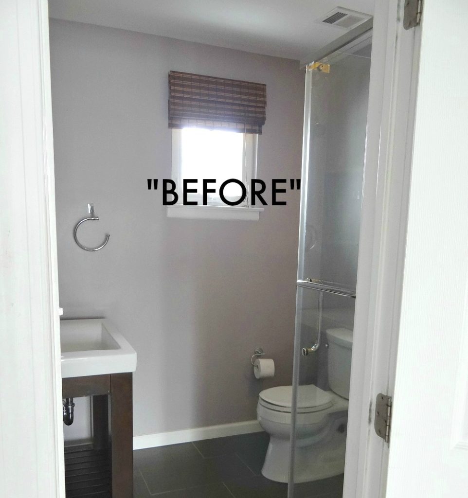
Here’s the “Before” photo to refresh your memory of our guest bathroom when we first started this challenge. Notice the color of the vanity and the bamboo shades. Both got a makeover this week!
[Affiliate links are provided below for convenience. For more info, please see my full disclosure here.]
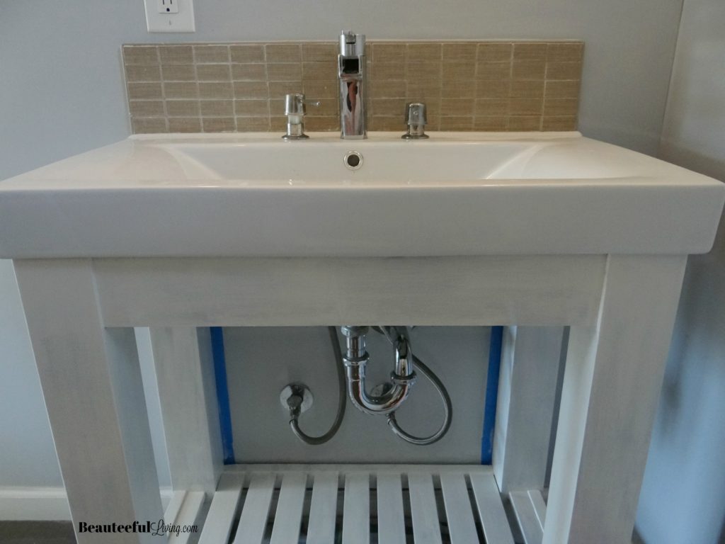
Whenever I start priming a piece of furniture, I get a little nervous. The first coat always looks uneven but after the second coat of primer, I feel a little better. Below photo is how our vanity looked after 2 coats of primer.
When you’re not sanding furniture, priming is especially important. It helps the new paint color adhere to the furniture!
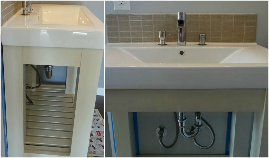
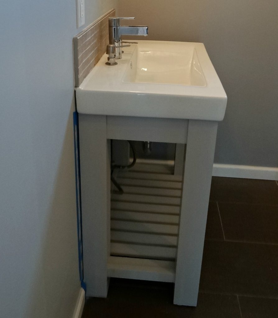
After the primer dried, I gave our vanity 2 coats of this tan-like paint color. My plan was to have it match the tile above our vanity top but the color didn’t quite go with what I had in mind.This is when you make the judgement call on whether you would sulk about it just deal or do something about it.
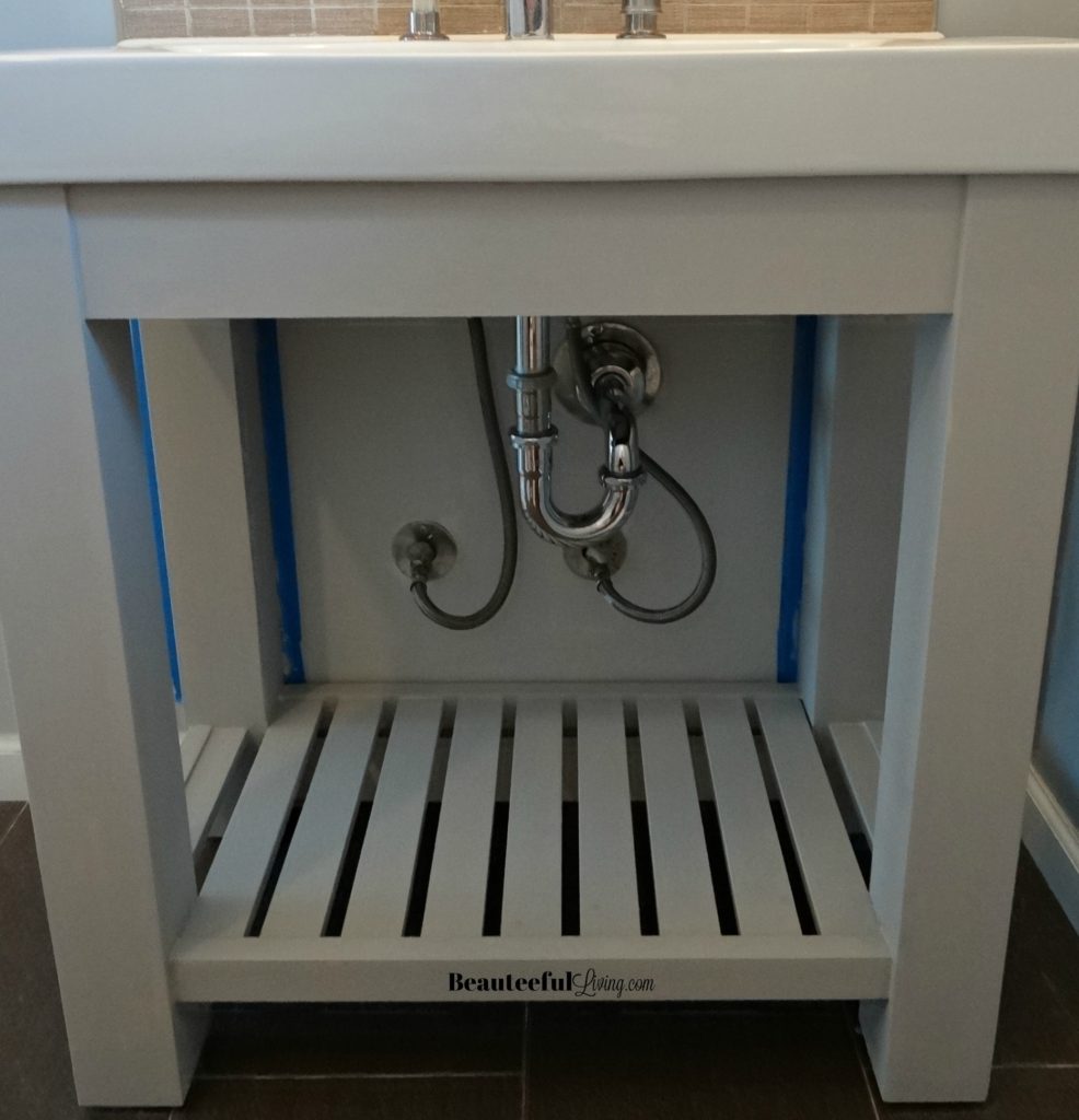
I decided to do something about it and repaint the vanity again. At the very beginning, I did think to repaint the vanity gray but decided against it because I thought it’d be too much gray.
Turns out there’s NO SUCH THING AS TOO MUCH GRAY! 🙂 You may have seen a sneak peek of this in my Instagram story.
I’m liking this gray much better than the tan-like color from the first 2 coats of paint.
With the vanity repainted gray, my bathroom looks a tad closer to my inspiration photo below:
 (Image courtesy of designer: Tracy Lynn Studio via Houzz // photographer: Zack Benson
After our vanity got refreshed from walnut brown to gray, our dark bamboo shades in the bathroom appeared out of place. I knew I had to lighten it too.
I decided to do a white-wash paint on the blinds! (Will share tutorial in a future blog post.)
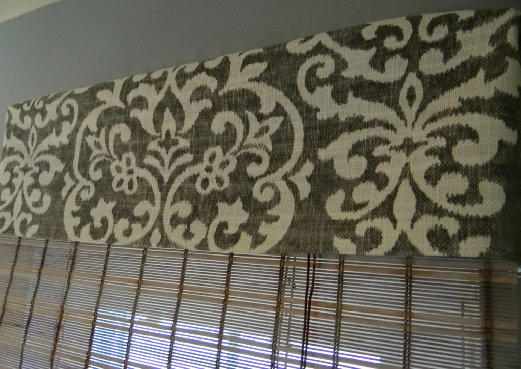
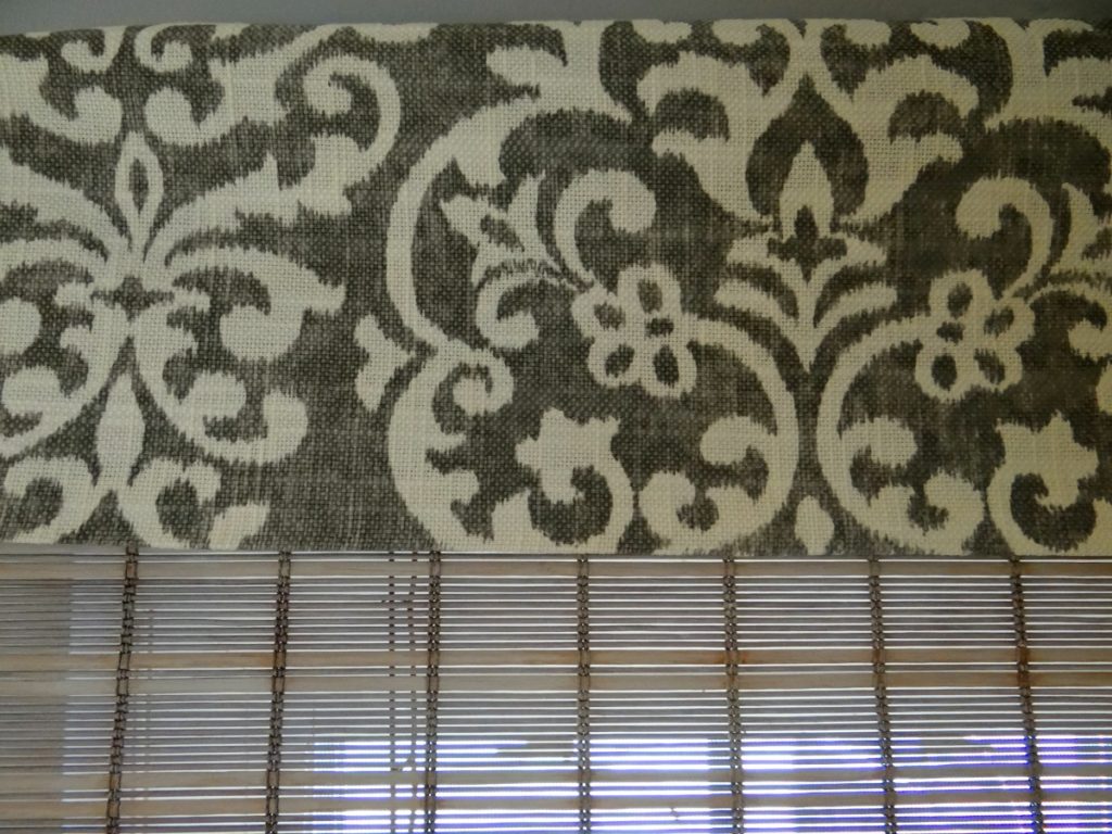
Here’s how the blinds look with my no-sew valance that I just did the other day!
The white-washed bamboo blinds go nicely with this white and gray fabric.
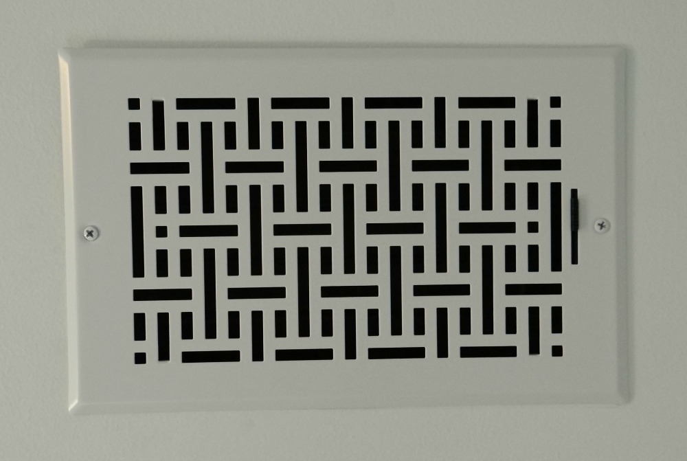
Small details can make a big difference in room makeovers. Sometimes it’s as simple as switching out vent covers.
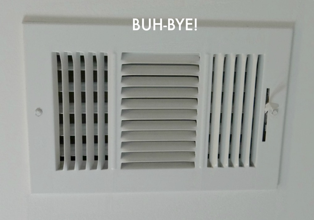
This vent cover sits on the guest bath’s ceiling. It’s very visible so I had to give it the heave-ho 🙂
I replaced it with this vent cover I purchased recently. You can pick this up at Lowe’s or order something similar online here. The design is so much more modern and pretty. Well, as pretty as a vent cover could look. 😉
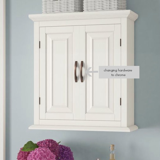
Before I go, I’d like to also share this photo of the new wall unit that got delivered the other day. I opted for a cabinet that conceals all of its contents (details here). Exactly the storage that we need for a small guest bath!
By the way, I’ll be changing the pulls from bronze to chrome.
Like this post? Please PIN/Save for later.
Big thanks to American Standard for being a sponsor of my spring 2018 guest participation in the One Room Challenge! Stay tuned for next week when I’ll be sharing all about our new toilet from American Standard and a surprise item that our guest bath never had before!
Don’t forget to check out the projects from these 20 designers here and the guest participants here. Have a comment or suggestion for this makeover? Please leave in comments below.

Let’s connect on social media: Facebook, Instagram, Pinterest, and Twitter







Wow your progress is looking great. Love all the pretty details your adding like the new vent cover. I think the grey paint looks great.
So smart white washing your blinds, I love how they turned out! I agree with you on the vanity paint color and how clever to replace your vent cover… I need to do that!
Add me to the list of people who didn’t know you could get prettier vent covers!
Your space is really coming along! What a pretty new vent cover. I’ve never seen one like that before.
Tee, the bathroom is coming along so nicely! Love the soft gray on the vanity, and the valance is beautiful. Replacing vent covers are on my to-do list around here… 🙂
Looks gorgeous! I especially love the vent cover- You made a mundane item look beautiful!
Your bathroom refresh is coming along well! Can’t wait to see your reveal!
I didn’t even know vent covers came with any other pattern – you learn something new every day 🙂
I liked the updated vent cover and valence! It’s looking so much better.
You are so right, there is no such thing as too much gray!! That vent cover looks great, I can’t wait to see next week!!! Only two more weeks!!
Tee, I love the vent design. Vent are one of those home features that just never look good, but this is a great idea. Coming along really well.
Wow, Tee. The blinds are beautiful! Did you do a DIY post? I bet lots of folks would love to copy your fab idea. Every week, I wish my powder room was getting a redo….and I dream of your inspiration room. LOVE it! You are going to have a fab bath! So thrilled for you! See you next week. ~~ Susie from The Chelsea Project
Yes, I’ll be doing a tutorial in a future post, Susie. Thanks for your sweet feedback on the blinds!! There’s still lots to do but I’m so excited to get this fully revamped by Week 6! Xo